Monday, 12 March 2012

Non-smoker guide to lung cancer- Awareness Campaign

As my lung cancer awareness project has shifted to aim non-smokers instead of smokers, I have brainstormed and have created my initial visualisations showing how I could deliver this campaign.

I have decided to create a text image of a lung to create a infographic based visual that informs the viewers the message that although the primary cause of lung cancer is smoking, lung cancer does not only affect smokers but also non-smokers. In order to highlight this, I have used my statistical findings to create a more convincing tone of voice. The pink and white hues help to capture the lungs but also helps to induce a softer tone of voice. I have tried to convey that the organisations are there to support people. I know that the typography isn't right at some places but I am just trying to create quick visualisations just to show my idea.

© Kasumi Miyake 2012

© Kasumi Miyake 2012

© Kasumi Miyake 2012

I thought that the QR code could slowly appear as if mimicking the sign of a lung cancer as you would see in an x-ray to highlight the importance of seeking early diagnosis in a more subtle manner. This could also attract more attention due to the interactive nature of the poster due to the movement. However, I am not sure if this is a bit too ambiguous.

Strategy:
I have decided an app would be the primary media tool to reach and interact with the audience because it can be downloaded instantly, easily and for free. The app can be downloaded and viewed privately by the audience so they do not have to feel hesitant about finding out information. They can view it at a time and place they feel comfortable.

© Kasumi Miyake 2012
 The audience can simply snap a picture of poster and be directed to iTunes where they can download the app for free.
© Kasumi Miyake 2012
 I have started considering the features the app would need and the basic layout. I think four main headings will help to categorise and organise the information needed for the audience. From these categories I will need to further develop what information needs to be included. I intend to use the same visual aesthetic of the poster to keep it cohesive.
© Kasumi Miyake 2012

Sunday, 11 March 2012

Cadbury Fill in form

Once the audience scans their QR code they will be automatically directed to a webpage where they can fill in their contact details to receive a free Cadbury Bubbly bar which will be sent to their doorstep.  I have tried to keep with Cadbury's brand aesthetic by employing the purple hue and logo.  I have also included social sharing tools (fb, twitter and Google talk) so that the audience can create buzz and get more people to know about the product and try the product. This could help to generate hype for the campaign.

Initial webpage visualisation (click on the images to see a bigger image version)

© Kasumi Miyake 2012
Simple and minimal.

© Kasumi Miyake 2012
Circle bubble vectors to anchor the product and QR code poster.
© Kasumi Miyake 2012
Bubble wrap popping game on the side. Perhaps this could appear while the page is loading so that the audience can interact with a game whilst waiting for the page to enter.


Poster sale for funding degree show

One-off posters are going to be sold to raise money at Orange tree (Fund Fest event) on the 13th of March to fund Loughborough Visual Communication's Degree Show.

Please show your support and buy a poster! And come to the FundFest event!


© Kasumi Miyake 2012

Saturday, 10 March 2012

Week 4 Review

The feedback I received from my tutorial has informed me to modify parts of my projects and has allowed me to see where I can develop my concepts to allow maximum potential to become successful campaigns.

In summary:


Cadbury
- can also be advertised at cinemas
- change the direct mail so that it can be shared via social media (have a QR code which will direct the audience to enter their details to receive a free bar- this will allow the company to receive information about their audience as well)
- visualise the pitch with an infographics aesthetic

Lungs
- instead of targeting the mainstream smoking audience, target a niche audience so that the campaign has a more specific message.
- the campaign could consists of a poster that enables the audience to download a free app and check their symptoms?

Gift card
- the international/transatlantic idea concept is good, perhaps amazon would be a good company to use for the gift card as it can send worldwide
- the idea of personalising the card via recordable voice message makes it more appealing and thoughtful

Cadbury 'Recieve a free bar' 

This part of the campaign will consist of a poster/ flyer (some kind of print medium which has not been decided at this moment).

The viewer will snap the QR code from their phone and be directed to an online website where they enter their contact details to be delivered a free bubbly bar. The form will include a sharing tool so that people can spread the word to create hype.

I will also visualise the website and this could bring other media activities to be incorporated eg. online Cadbury games etc.


Print visualisation development
© Kasumi Miyake 2012
 I have employed Cadbury's brand colours so that viewers can immediately recognise the print to Cadbury. To capture the product, I have utilised a soft rounded and three-dimensional form to the typography to make it appear like bubbles.  The QR code helps to anchor the brand as well as making it more aesthetically interesting than monochrome QR codes.

© Kasumi Miyake 2012
 Testing with the product image on.

© Kasumi Miyake 2012
 Testing out with a light background to see if it works better with greater emphasis on the product through the contrast.

© Kasumi Miyake 2012
 The darker purple hue is more aesthetically fitting to Cadbury's brand image. The product would not need to be placed if I can evoke the 'bubbliness' of the product via the visuals.

© Kasumi Miyake 2012
By refining the visuals with more three-dimensional looking bubbles that are in the colour of chocolate helps to convey the 'bubbliness' of the product. The Cadbury logo helps to amplify the brand's image. The glowing font effect helps to attract more attention and evoke the need to attract attention like a treasure which in this context would be the freebie. I intend to further develop and refine this latest development by refining the bubbles.

If I go along with this then this may mean that I do not execute the bubble wrap direct mail concept.
Or i could modify this design to fit into a direct mail.

Bubble wrap direct mail prototype 
(note: this is just a quick prototype to explain how the direct mail concept works)


© Kasumi Miyake 2012

© Kasumi Miyake 2012

Thursday, 8 March 2012

Research publications

In order to find a more effective approach to target my audience, it is vital to understand what strategies have been utilised for current campaigns.

I ordered publications from MacMillan and Roy Castle Lung Cancer Foundation for my research so that I can look at the designs and information provided on the publication to see what key messages they voice out in their campaigns. 

Supportive voice given for those who are experiencing Cancer.

Informational booklet with lots of information on lung cancer.
Early diagnosis posters with brief information on lung cancer (information provided in Welsh as well).

 Bold colour usage. Key message: Early diagnosis. Call to action to get people to check up early.

 Bright colour usage. Focus on the content than the visual in terms of imagery. Straight to the point message.

Tuesday, 6 March 2012

Cadbury Project- Direct mail and Side view store visualisation


Cadbury project draft visualisations

For the project I intend to present my concept in the form of a pitch, accompanied by diagrams that demonstrate my Cadbury Bubbly interactive floor projection concept. I have drawn a rough sketch (see below) showing how I intend to present my visualisations on the page.

© Kasumi MIyake 2012

Side view draft mock up.
© Kasumi Miyake 2012

© Kasumi Miyake 2012

© Kasumi Miyake 2012

© Kasumi Miyake 2012
These mock up diagrams illustrate the concept in context with the supermarket shelves in the backdrop. I will modify the bubbles to move away from the consumer as after having received feedback, people have voiced that they may feel claustrophobic if the bubbles were moving towards them. Instead, having them move away from the consumer would help to connote the light airy texture of the 'Bubbly' chocolate bar. 

The floor projection will be located in the confectionary aisle of main supermarkets. The projection will be overlaid with interactive bubbles. I have tried to develop the illustration above my putting more detail into the background to have a greater sense of the situation the display would work in. 


© Kasumi Miyake 2012

Once a customer steps onto the floor projection, the interactive bubbles will move away from the customer. The bubbles will be accompanied by popping bubble sounds to enhance the 'Bubbly' experience. 

© Kasumi Miyake 2012
The display will reveal a floor space in Cadbury's signature purple colour once the customers step onto the floor projection. Images of Cadbury Bubbly bars will hidden beneath the chocolate bubbles layer along with images of the Cadbury logo to enhance the brand recognition to the customer. 
© Kasumi Miyake 2012
The bubbles will move away from the customer wherever they walk on the projection area. So if more customers are on the projection, more logos and the product image will be revealed. 

As I will need to refine the images by developing the aesthetics to progress to my final outcome I will need to consider: 
- incorporating shoppers into the environment
- refining the supermarket shelves display
- Drawing the bubbles to look more three dimensional and 'bubbly'.
- Capture the light feel of the bar by making the layout of the bubbles less structured. The lattice arrangement to to orderly, inhibiting the sense of fun and adventure of Cadbury's brand. 

 Direct mail 
© Kasumi Miyake 2012 
Direct mail advertising will be accompanied by the projection advertising.

Delivery:

Envelope in the form of the Bubbly Chocolate Bar packaging containing a brown bubble wrap fused with chocolate inside the air bubble.

Audience wil open the envelope to see the bubble wrap.

Audience will burst the bubbles and experience the smell of chocolate.

Cadbury coupon is revealed underneath the bubble wrap (as shown by images below).
© Kasumi Miyake 2012
Areas to refine:
- Coupon design
- Create a mock up prototype to see visual in context. (Buy bubble wrap- test how it works and how it looks and receive feedback from consumers).

Sunday, 4 March 2012

Week 3 Review & Gift card

Review

Project One- Cadbury Bubbly Project

- Modify the bubbles so that they move away from the consumer
- Consider placement of logo/ think about how the customers will walk along the display
- Create the visuals along with the popping bubble effects, Create a flash animation to demonstrate this

Project Two- Lung Cancer Awareness Project

- Decide whether I want to keep the project using an interactive approach or revert to posters
- Find the right location to advertise this.
- Targeting smokers instead of the general public would help to narrow the audience range. Considere where smokers would and wouldn't be. Possible location to advertise: bus shelters/ just outside buildings where smokers usually smoke due to smoking ban in indoor public spaces.
- Make the awareness project a more support tone of voice.

I need to carry out further research to find the best way to approach the target audience by conducting a survey to smokers.


New project idea- Gift cards

I have realised that there are a variety of gift cards sold in supermarkets but they never really actually got my attention. iTunes is the first gift card that springs to mind but what about other brands?


Amazon, Currys, WHS Smith, Next, Debenhams, Pizza Hut, Argos, H&M, Starbucks...the list goes on.
I never really buy gift cards myself to give as gifts just because they seem to lack thought. It seems to lack the personal factor that makes presents special. Birthday cards on the other hand usually have personal messages in them, so they seem more unique and what it written inside is what makes the card special. The card alone without the personal message wouldn't be as special although receiving a card with a nice design is nice. Which made me realise that the designs of the gift card can influence a customers decision whether or not to buy the card. As with any other product, if it looks good, consumers are more likely to buy it. 

Does the design of this gift card make you want to buy it to give as a gift?


Personally, the design of the gift card doesn't appeal to me. Although I'm not against minimal design, the design seems to lack a celebratory mood. The blue hue feels a bit cold, and although the subject matter is a photograph of a balloon there is nothing else that evokes birthday. The white confetti doesn't seem to fit aesthetically, it appears as though it has been included to try to create a more lively atmosphere in the composition. 


Take a look at the products sold. The design of the gift card and products which both aimed for birthdays is very much different. The bright colours, lines and patterns are much more joyful capturing a more celebratory atmosphere. This visual aesthetic seems to encapsulate 'birthday' better although it can be argued that the gift card is targeted towards an older target audience (thus explaining its photographic and minimalist treatment to appear 'sophisticated').

So with this, I thought it would be better to redesign the existing gift card by making it more appealing in order to generate an increase in sales. 

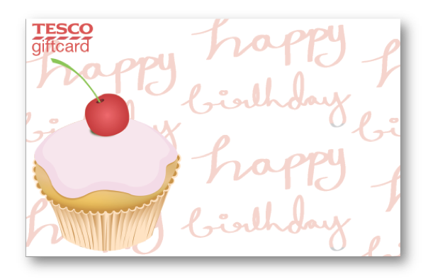
Brief: To redesign the birthday version of the Tesco giftcard. Consider the target audience of the people who would be more likely to give gift cards and those who shop at Tesco.

My initial ideas comes to designing a gift card that would visually appeal to females as they are the predominant gender who shop at Tesco. Males also tend to take up the larger share on buying gift cards.

Initial design
© Kasumi Miyake 2012
I have tried to make the card instill a more personal tone by employing a handwritten typeface, I am still not convinced of buying gift cards. Although the gift card is more appealing aesthetically, if I were to receive a gift card, I would prefer to receive this one over the other one, there is that lack personalisation to the gift.

Could the gift card service be improved? Can we put in that touch of thought which makes gifts special?

Areas to refine

Can I modify this gift card so that consumers can include their own personalise message printed on the gift card so it acts as a birthday card but has the bonus of the gift value? (The pros of a gift card is that the person can buy what they want from the place). Will it be better if there is a create your own gift card generator online which will allow the gift card to be sent directly to the addressee. Then they can customise their own gift card with their own photos/ or pick and assemble given illustrations to arrange the design of the card?