Wednesday, 30 November 2011

Project updates

After receiving feedback from my tutorial yesterday, I have refined the illustrations behind the tagline 'What makes you...?'  so that it is more legible. I also received feedback suggesting that I make the palette range smaller. I have tried out limiting the palette range but I feel that they do not work as effectively as this composition because the limited colour palette range makes the colours blend together, making the composition appear flat.

© Kasumi Miyake 2011

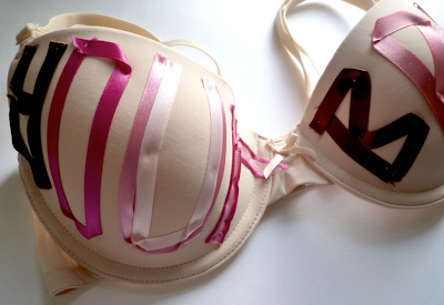
As my sewing skills are not particularly good, I have tried to create a visualisation of the typography on the bra. I did this by scanning the typographic letters that I made and have repositioned them onto the bra creating a more refined execution due to the lack of running stitches. I need to find out if I could execute this as a visual instead of a real object, supported by a storyboard to present how this would work in context.

© Kasumi Miyake 2011

Monday, 28 November 2011

Final Outcome

The feedback I received from my last development was focussed on the background. I have modified the gradient background by incorporating purple to enhance the contrast and inhibit a stronger depth of field. This has helped to create a more balanced composition that works as a cohesive and unified visual that draws the viewer's attention to the product whilst effectively encapsulating the cheery, playful and fruitiness that Feel Good embodies. 

Sunday, 27 November 2011

YCN brief..is it finished?

A few refinements have been made from the last development where I have:
- tried to make the gradient contrast bolder to create a more balanced and impacting visual
- to make the 'What makes you..?' typography more legible by adding a light blue outline
- changing the red hues to pink hues in the curvilinear lines. 

I am happy with this design as a final outcome but am not entirely sure if this is completed.

I hope to get some feedback to hear what people think of the design!

Is it finished or not? Is there any part that could be modified?


Friday, 25 November 2011

YCN brief update

I have adapted the colours in the background so that the product appears more prominently. I have added butterflies in the composition but I am not sure whether they work. Let me know your thoughts.

Thursday, 24 November 2011

Bra donation project

Brief:

To create a national campaign that informs and persuades females to donate their old, unwanted bras into Bra banks situated across the nation for a better cause.  Useable bras collected from the Bra banks are sent to Kenya and Zimbabwe and donated to females or are recycled by the BRC (British Retail Consortium) where £1 per kilogram of bras collected will be donated to the Breast Cancer Research charity. Many people are unaware of this scheme so it would benefit from more coverage through advertising to generate more donations whilst raising awareness for Breast Cancer.


Prototype:


© Kasumi Miyake 2011

© Kasumi Miyake 2011

© Kasumi Miyake 2011

© Kasumi Miyake 2011

© Kasumi Miyake 2011

© Kasumi Miyake 2011

© Kasumi Miyake 2011

Execution:

Typography will be sewn onto bras informing customers at lingerie shops about the bra bank scheme. These bras will be hung on the racks along with other bras that are sold in lingerie shops. A freepost envelope bag will be situated beside the shopping till for customers to feel free to pick up. The freepost bag will have photographs of the typography on the bra so that the customers can easily identify them.

Development:

The prototypes are just to reference the look as a visual. I will have to refine the typography on the bras to make it more legible and clear. The final designs will be hand sewn with care, taking into consideration of stitching. 
After I produce the final outcomes I will photograph the bras professionally so that I could use the photos to place onto the freepost bags for the customer to identify the scheme with the bag.


Wednesday, 23 November 2011

YCN development // NikeID visual merchandising

YCN drink project brief

I have delved into exploring using different colour ways as stated in my previous post. I decided to test if the other Feel Good product ranges would work with this visual illustration. The yellow composition has tried to create a stronger emphasis on the product by utilising a glowing effect. With the feedback that I got from my peers, they thought the glowing effect created a nice aesthetic that made them identify the product more easily and they thought that it suited well with the Feel Good brand logo of the person meditating. 


Other feedback that I received was that the later compositions without the figures in the composition worked more effectively in evoking the Feel Good mood. The characters seemed to detract attention away from the product. The white musical notes seem to help to add a nice touch to the visual aesthetic combined with the different opacities to evoke fun. In terms of colour choice, the yellow one was preferred (with the red drink) as the contrast helped to emphasise the product. Perhaps I could explore using different gradients in the background in order to make the white stencils appear strongly whilst making sure that the product is also presented as the centre of focus.

Areas that could be considered or developed are: incorporating good vs evil theme- having the colourful imagery be fighting against darker colours and battling. This could be expressed through the bold bright colours overtaking dark colours often used to associate with evil. I could also explore with photography- buying the product and experimenting different ways of presenting the product. i.e. having the bottle cap opened and showing that all the playful illustrations coming out of the bottle and spreading out of the composition to evoke that drinking the juice will make you 'feel good'. 

As this project is only a short project where I have set myself two weeks to work on, I may be restricted in exploring these areas due to time restrictions. 


NIKEID window display for London store

Concept for creating the window display for the NikeID studio store.


Kasumi Miyake 2011 ©

Concept: Have a pair of white Nike shoes placed in the middle of the shop window display. The window display detects the movement of passerbys when they walk near the window display. The shoes would move to the height of the passerby and spray cans that are positioned at different angles in different places would spray the shoes in different colours. (The spray ink would be one that could be easily removable or the shoe could have a plastic coating so the paint can be re-applied several times. This would be engaging as the while spray painting would be seen as a performance. 


Kasumi Miyake 2011 ©

The focus on customisation of NikeID shoes is the main selling point. In order to convey to the passer bys the idea of designing your own customised shoes, I have thought of a concept which allows to express this visually by having each layer of the shoe as a wall hanging. The layers of fabric will be hung at an angle so that from one end of the display, the layers will appear like lines of colours but as people pass by to the other end of the display while they are walking by, they will see the whole shoe appear. 

The concept which I have chosen to develop is an interactive window display. Although I feel that the previous two concepts would work effectively, I thought it would be good to have window display that is current, making use of the technology that is available. Creating a user experience is important to engage viewers to create an interest or loyalty to brand. 

This window display will be sensitive to movement. When a person walks by, the screen will detect movement. When it detects movement, the splash of ink colours will surge up from the bottom of the window display to the top, to create impact and attract attention. The array of colours will convey how array of colour choices that could be made when customising your NikeID shoe. Once the ink splash surges up, a screen will appear for people to use the NikeID generator where they can customise their own shoe very simply by choosing colour and fabric options on each layer of the shoe. Once they have designed their unique custom shoe, the NikeID generator will dissolve to white and change to a screened live catwalk of a mannequin wearing their customised design. The shoe design will also appear above the live catwalk for the members of the public to see in closer detail.

Kasumi Miyake 2011 ©

Originally, I was going to set up a window display with the customers inside the display designing their shoes on a touch screen display and then wear a tag device in which they can see on screen live, of themselves wearing their shoe and running down a catwalk down the window display, but customers may not feel comfortable to be seen by a live audience. Another limitation on this is that customers will not always be constantly trying out the NikeID generator so there will be times where no one will be in the display, so passerbys won't be seeing anything but a plain white runway with a touch screen panel on one side.

Tuesday, 22 November 2011

Poster development

Although I have executed the visual aesthetic style of the illustration, I have adapted it to create different outcomes by changing the illustration slightly. This will allow me to see which outcome would be most effective for the Feel Good advertising campaign.


The incorporation of figures in the composition creates a friendly mode of address that will appeal to consumers through personal identity creating a connection with the audience and product. This would be more appealing to a younger target market, attracting children and parents of young children.


I have erased the human figures in the composition. This composition would appeal to a wider audience range as the utilisation of cartoon figures attracts a young child audience leaving the focus on the abstract shapes. The composition maintains to induce an energetic atmosphere and happy mood by the bold colour range. 


Another small refinement made was adding flowers to the composition to create a contrast in the composition through the change in scale. By placing large flowers on either side of the bottle helps to draw the eye towards the product and visually enhance the sense of balance in the composition.


Having explored different changes in the subject matter of the composition, I have explored using a different colour for the background. I tested out different colour ways but found that it was hard to select a colour that would not detract the viewer from the product whilst maintaining harmony with the palette range employed for the subject matter. I found that this red hue managed to anchor the colour of the product without creating a clash with the rest of the colours. In comparison to the yellow composition, this red one has a stronger sense of depth induced perhaps by the contrast created from the white shapes in the composition. This seems to work more effectively in creating the energetic atmosphere I intended to create to evoke the sense of fun and joy the product can give to its consumers.

Monday, 21 November 2011

YCN Illustration development

I have worked on the illustration for the YCN project brief focussing on organising the composition by laying out the illustration to compose the work.


After laying out the drawings I have filled the colours using a similar palette range to the colours I had picked out in the previous composition in order to create a uniformed composition.


I will need to make further adjustments to the colours and incorporate more white shapes into the piece. I will also have to refine the black outlines to appear more like the sunshine, blending as a graphic that enhances the uniformity of the layers. Some of the free space could be filled. At the moment the composition lacks depth, I will have to adjust the opacities to increase the depth of field to inhibit a sense of space and envoy a sense of fun into the composition through the playful layering effect.


Alongside working on my project, I attended a meeting for the preparation of the course's degree show. All students on the course would benefit from having a show in London to present their work on top of our University degree show and the D&AD (because only a few people on the course will be selected to display their work in D&AD). I am part of the Concept committee which is generating the look and feel of the degree show. Our meeting was a productive one, with six of us pitching our ideas and opinions. There were quite a few ideas that we felt were particularly strong and decided on the strongest one which we could develop. We have assigned each other to look into different categories for the concept. I am responsible to research into the typography before Wednesday's meeting to organise our pitch which will be presented on Friday to the Vis Comm course.


All images are copyrighted by Kasumi Miyake 2011 ©

Sunday, 20 November 2011

First semester of final year

I am currently studying in my final year of BA Graphic Communication.
For this semester I am setting my own project briefs to build up my portfolio.
I am currently working on three projects:

Brief 1) Bra recycling campaign.
I wanted to work on a project that I feel strongly about. One thing I strongly support is recycling. I initially set myself to do a campaign that promotes recycling to households but found myself to find a bra bank recycling scheme that would benefit from advertising. This bra bank campaign encourages women to donate their old unwanted bras to women who cannot afford them in Kenya and Zimbabwe. If the donated bras are unable to be given, they are recycled with a donation of £1 per kilogram to Breast Cancer Research.

Execution: I have reached the solution of reaching my intended target audience of females by placing bras decorated with embroidered typography in underwear shops informing about the campaign. Free post bags will be of the same aesthetic as the bras with the typography located at the till of the underwear shop for customers to feel free to pick up without having to purchase a product from the shop.

I will get back to this project by posting my prototype.

Brief 2: To create the window display for the NikeID store in London.
My interest in visual merchandising, fashion and advertising has led me to set this project brief. Nike has a range of shoes that can be customised by the customer- they are able to choose the fabrics and colours of the different part of the shoes to create their unique pair of shoes that reflects their style and personality. My aim is to create a visually interesting window display that attracts customers and encourages them to come into the shop to experience and discover NikeID.

Execution: I have come to the concept of using an interactive window display that will be in the form of a touch screen window panel to attract people passing by the NikeID shop. They will be able to experience NikeID's shoe customisation and be part of the creative process of designing their own unique shoes. (I will post photos of my ideas later this week).

Brief 3: YCN project brief for 'Feel Good' drink campaign.
This is a student competition brief to advertise a natural fruit drink called 'Feel Good'. The brief is simply to make their brand famous.
Execution: I will be creating an illustration that evokes a sense of fun and capture things that makes people 'feel good'. The illustration will be playful, with hand-rendered imagery and style to fit the brand image of 'Feel Good'.

Execution: I am currently developing the visual for it.
I will be posting the illustration on an ongoing basis to show the process to the final design.
I am basing my final design on my initial sketch below.


All images are copyrighted by Kasumi Miyake 2011.