Friday, 27 April 2012

Cadbury bubble animation and lung project floor projection animation

I have animated the bubbles for the QR poster and the webpage to give a better visualisation to present how they would appear to the audience in correlation with the interactive floor projection.

QR poster animation © Kasumi Miyake 2012

Webpage order form animation © Kasumi Miyake 2012


I have adapted the circles of the Lung Cancer Awareness Floor Projection to the lung shapes to anchor the lung cancer awareness message and app logo. I have decided to also use Motion5 to present how the interactive floor projection would work in context. Here are screenshots of what I have managed to animate so far. 

© Kasumi Miyake 2012

I have yet to add the tag lines: smoker? non-smoker?  onto the lungs.
© Kasumi Miyake 2012
 When the user taps onto a lung the lungs capacity with change. The smoker's lung capacity will decrease to visually show their 85% chance of contracting lung cancer.

I have yet to add the percentages onto the lungs.


Tuesday, 24 April 2012

Project Developments

My mid-term tutorial feedback focussed on allowing myself to focus on refining my designs and prioritising my projects so that I could finish all the projects to the best standard in the time that I have left. 

I received positive feedback for my Cadbury, Zara and Palmer's project- just getting the final presentation finished. However, I still need to refine my Lung Cancer Awareness Project and Amazon Gift card service project.


CADBURY

Poster design
© Kasumi Miyake 2012

The earlier poster development I had was in the form of a square but considering that most posters are rectangular I have adapted the composition. I have rendered the bubbles by creating my own bubbles in Photoshop so that it would fit with the aesthetic of the floor projection animation.

Webpage delivery form
© Kasumi Miyake 2012
Likewise, I have applied the bubbles onto the webpage.
If I have time I could possibly animate the bubble so that they move around like the floor projections animation.

Interactive Floor Projection Animation
© Kasumi Miyake 2012

© Kasumi Miyake 2012
 
I have attempted to animated the bubbles to show that when a person steps onto the projection the bubbles will move away from the person. I have been finding it challenging to find a way to capture the right moving movement as if the bubbles are repelling the person. At the moment, I have only managed to get the all bubbles to float away gradually.


LUNG CANCER AWARENESS

Floor projection Beginning
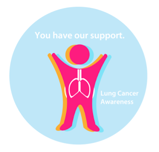
© Kasumi Miyake 2012 
© Kasumi Miyake 2012

The Lung Cancer Awareness projection can be further adapted so that the visuals is more identifiable with lung cancer. At the moment the circle projection can be applied to any concept. 

I have considered changing the circles to lung shapes, but considering how the circles shrink, the visual would not be anchoring the message as the lung appear to get smaller, they will appear to look weaker.

I will need to find a solution to the visual aesthetic of the lung cancer projection so that people can easily recognise the projection is about lung cancer.


PALMER'S HAND CREAM REDESIGN

Poster design

© Kasumi Miyake 2012

I have made small refinements to the poster after critical feedback from Kathy, I have applied shadow to the products so that they appear more prominent and have rendered the typography. 

Saturday, 21 April 2012

Palmer's second round feedback refinement

Receiving feedback to test my product design and poster design for my Palmer's project has been critical in influencing my design decisions. The questionnaire I conducted made a big influence in changing my design solution for the hand cream. Although I was quite satisfied with the design aesthetic for the most latest development, I conducted another form of feedback by asking people to write their thought on the product design and poster designs on a post-it note.

Some remarks that appeared to be brought to attention regarded about activity, colours and tagline of the posters. There were no remarks on the improvement of the product design. A suggestion made to incorporate the old packaging with the new packaging was made which may be quite useful so that current customers can easily appeal to the new product by recognising the old product design.

Based on the remarks and suggestions, I have modified the poster designs.


Old with new product design
© Kasumi Miyake 2012

 Thin border
© Kasumi Miyake 2012

 Gradient shine
© Kasumi Miyake 2012

 Deeper red
© Kasumi Miyake 2012

 Light to darker gradient
© Kasumi Miyake 2012

Cadbury Floor Projection Animation

I scheduled an IT tutorial with Andy Chong to seek advice on creating an animation that would demonstrate how my floor projection for the Cadbury project would work. I pitched my idea through all my visuals I have developed so far to explain how the concept works. He has advised me to use Motion5 software to animate the bubbles, logos and product.


As this software is new to me, I have found it challenging to navigate myself around the tools.   I gave myself a day to play around with the software to know what I could achieve with the programme. 


I have collaborated with Victoria to help me create the animation as she has had prior experience with the programme. She has helped a lot in teaching me the basics of the programme so that I could apply the techniques and render the animation. 


Below are some stills and videos demonstrating the development of the motion animation. 


1. Cadbury hue background
© Kasumi Miyake 2012

2. Cadbury tiled logo background
© Kasumi Miyake 2012
 The logo helps to anchor the product so that consumers can easily recognise and associate the chocolate bubbles to the brand.  However the tiled approach may appear too busy considering that the bubbles will be the main focus and will be animated throughout the animation. 

3. Single logo background.
© Kasumi Miyake 2012
 The single logo background is more simple and gets the consumer to look at the logo without being too distracting.  

© Kasumi Miyake 2012The bubbles with the Bubbly bar. I have also incorporated one of Dairy Milk's logo as well as an experiment.
4. Stills from sequence
© Kasumi Miyake 2012


© Kasumi Miyake 2012


© Kasumi MIyake 2012


© Kasumi Miyake 2012


© Kasumi Miyake 2012


© Kasumi Miyake 2012


Video sequence animation development


(I have been trying to upload the other videos but there has been technical failures).


Next steps to take:

I will need to refine the movement of the animated bubble so that they are more dispersed around the whole frame

I will need to organise the Bubbly bars to flow around the frame constantly so that throughout the whole sequence the product is viewed by the audience

I will need to demonstrate the movement of the bubbles when a person interacts with the projection. 

          - I could possibly achieve this through incorporating animated footprints to appear in 
            the clip

Sunday, 15 April 2012

Re-edited Palmer's Poster

© Kasumi Miyake 2012

I have changed the aesthetic of my latest developments as the product design appeared to conventional. Although the respondents said that the design I created was more appealing than the existing design, I felt that perhaps the product lacked a modern aesthetic by keeping to its traditional aesthetic too much. I have changed from using a predominantly brown hue colour to a more  golden shade utilising brighter colours. I have incorporated light green tones, orange and pink in order to create an uplifting, modern and fresh appearance as some of the feedback I had received touched upon the colour palettte.

I have adapted the initial poster aesthetic I had utilised in my early developments where I had concentrated on pink hues to fit my latest refined product design. I have employed golden hues (see above image) to convey the butteriness of the cocoa and organic visual elements to anchor the organic natural ingredients. The images below showcase my earlier developments, experimenting with colours and layers.


Earlier developments
© Kasumi Miyake 2012


© Kasumi Miyake 2012

I have produced another advert design to re-establish the brand in the market. Instead of focussing on the product design as the focal point like the advert at the top, I have focussed on establishing the new logo. This will enable consumers to recognise and become familiar with the new logo so that they can easily recognise the new product design. As the logo is rather simple, I have focussed on guiding the consumers to remember the logo by anchoring the logo with an product placement image on the bottom right hand corner of the advert.  I have experimented with different colour ways to see which would be most effective. The cream coloured seems to work best as it helps to enhance the logo image. By keeping to a simplistic design and utilising a minimal strap line the visual is aesthetically impacting and easy to remember.

© Kasumi Miyake 2012

© Kasumi Miyake 2012

© Kasumi Miyake 2012

Friday, 13 April 2012

Palmer's development from feedback


© Kasumi Miyake 2012
After conducting a survey on my latest design developments, I have found that the design lacked clarity in terms of the hierarchical structure of the information. I need to make it more obvious that the Cocoa Butter Formula is the main centre of focus. Although the design was perceived to be more aesthetically pleasing than the current existing product, the product was very conventional in terms of colour usage and conventions. This is perhaps why the design may not really stand out from its competitors.

I have modified the logo- as the previous logo appeared outdated, by giving the product a much more modern and simple aesthetic. I have focussed on making the product look more simple, there was too much design elements that made it hard for people to read the text logically. I have chosen to change the palette range from brown to orange and pink hues to help make the product appealing and more unique. I have also modified the tube with a photographic representation to make the packaging look more professional by showing how it would look like in real-life.

I feel that this product is more effective .This design is more simple and clean. The text has been arranged so that the viewer is guided to easily read the most important information first by making the top area the focal point of the design. This helps to lead the viewer to view the label from top to bottom. The colours still help to convey the cocoa butter quality but also gives an appealing aesthetic from the bright exotic and eye-catching colours. The leaves vector help to suggest the product as an organic product. 

Wednesday, 11 April 2012

Palmer's redesign development


In contrary to my earlier Palmer's hand lotion redesign  (click here to view previous design,) I have modified the design to capture the cocoa butter scent selling point. My previous design was perceived by the audience as an appealing product that they would buy simply because of the packaging and not for its quality. As Palmer's is a brand with a long history company (known for helping to reduce stretch marks for women, revitalise hair and make skin smooth and well moisturised) the packaging would be better if it encapsulates the butteriness of the cocoa butter formula. I want to redesign the packaging to rebrand the product so that it is more modern and in keeping with young adult female target audience. 


Re-designs

© Kasumi Miyake 2012

© Kasumi Miyake 2012
I think that the cocoa bean illustration looks better positioned in towards the top of the product than towards the bottom as it anchors and highlights that the product is made from cocoa by attracting the eye's attention instantly. The coral pink colour helps to make the product look exotic and modern whilst appealing to a female audience because of the feminine hue. The brown logo instills an organic quality, suggesting that the product is made from natural goodness whilst anchoring the colour of the cocoa bean. The cocoa bean silhouette helps to anchor the product's cocoa butter formula. 
© Kasumi Miyake 2012
I have modified the typeface for the logo as the sans-serif typeface lacked character that conveyed the company's long history. I decided a serif typeface would be more fitting for the company as the sans-serif typeface's aesthetic is too soft, especially in relation to the illustration and brown hues. Out of these designs, the left one is most appealing, capturing a sense of nature, evoking the product as a product made from 'natural goodness'.  The green hue on the mouth of the tube helps to add interest so that it would  stand out from stock shelves. 

Best  design development so far
© Kasumi Miyake 2012

© Kasumi MIyake 2012
Just to seek out other colour alternatives, I have experimented with peach and brown hues to see which variations are most effective. I have also added a palm tree illustration to see if it would help make the product look more natural and exotic. However, it appears to catch the eye, taking away the focus from the cocoa bean plant illustration. 

I intend to ask the target audience their opinions of the designs I have created and refine the design according to the feedback.


Please can you fill in this quick survey! :)

Monday, 9 April 2012

Zara illustration on website and shopping bag

I have illustrated the model with floral and organic vectors to make her appear like a nature goddess than simply a model to enhance the pro Earth day and eco-conscious message. This appears to make the Earth day message more visually striking and incoherent with the background on the website as shown below.

© Kasumi Miyake 2012

Web design
© Kasumi Miyake 2012

Webpage layout with text type and model without floral patttern.

© Kasumi Miyake 2012

Hand typography for eco-chic Zara.

© Kasumi Miyake 2012

Hand typography with pattern on model.

© Kasumi Miyake 2012

Typeface with pattern on model.

© Kasumi Miyake 2012

Typeface with pattern accompanied with flower in the background and pattern on the model 
I have chosen the model with the floral pattern as she seems to visually capture 'eco-friendly' more than the one without the floral vectors. As the campaign is about anchoring Zara's environmental policy, this eco-branding of Zara will help to establish more customers who are environmentally conscious. As Zara tries to reduce wastage, has organic fabrics and PVC free shoes, the shopping bags are also recyclable and disposable. As a way to boost its eco message, I have implemented the web design to create a bag design that would be on Zara's eco-friendly shopping bags as part of the campaign.

Eco shopping bag design